In the past few months, we've become accustomed to seeing visual data on our TV and computer screens � from the multiple graphs used in Number 10's Covid-19 press conferences to the maps displaying the US election results.
Despite the importance of the information presented via these tools, many are unclear and confusing. Worse, some are misleading.
A prime example is the US presidential election map, where each American state is coloured according to which candidate won within that geographical region: red for Republican (Trump), blue for Democrat (Biden).
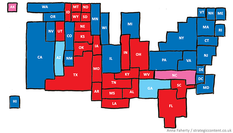
This is a perfectly useful map if you want to understand the political leanings of people in different parts of the country. However, it's less than ideal when used as a tool to track who may � or may not � be winning the election. For that, I offer an alternative version, shown below.

The visual quality of my hand-drawn map feels a bit rough around the edges, but it could easily be improved. It's also not geographically accurate, though most states are in more or less the correct location. But what it does far better than the map we've repeatedly seen on every TV station, newspaper and website is give an accurate depiction of who�s doing better in the race to be President.
In my alternative election map the size of a state reflects the number of electoral college votes that state holds. So, for instance, states like Montana, Wyoming and North and South Dakota appear much smaller than on a geographical map of America, since they only hold 3 votes each. Conversely, states like New Jersey and Massachusetts, which are smaller in terms of land area, appear larger, since they hold 7 and 11 votes respectively.
Overall, this means that a glance at the alternative map appears far more blue than a glance at the usual geographical election map. By the way, if your own glance has spotted the few pink and pale blue blocks, that's because this map shows the count a week after the election, when four states (Alaska, Arizona, Georgia and North Carolina) were yet to be called. Their faded colours indicate who was leading those states at the time.
This all might seem like a quirky visual diversion but, as I say in my course on Presenting Numerical Data, you should always design visual tools that support the message you want to share. If you share the traditional election map, the at-a-glance message is that Trump won the election (since there�s more red on screen). And we all know that Donald Trump and his supporters need no further encouragement to question the results of what � at least so far � seems to have been a free and fair election.
So next time you're choosing to display data in a map, a bar graph or a pie chart, think about the message you want people to take away from that image and choose the best tool to present it, even if you have to � as I did � make something entirely new.
Anna Faherty is an author for accountingcpd. To see her courses, click here.

You need to sign in or register before you can add a contribution.